
In this article we are going to discuss bootstrap from scratch, it's uses and implementation, although we have explained basics of bootstrap in this article,we will start the basics again for the readers.
What is Bootstrap?
>Bootstrap is the most popular HTML, CSS, and JavaScript framework for developing a responsive and mobile friendly website.
->Bootstrap is a free and open-source front-end web framework for designing websites and web applications. It contains HTML- and CSS-based design templates for typography, forms, buttons, navigation and other interface components, as well as optional JavaScript extensions.
->It is used for easier and faster web development.
->Bootstrap also gives you the ability to easily create responsive designs.
Responsive Web website meaning
A website is called responsive website which can automatically adjust itself to look good on all devices, from smart phones to desktops etc.
Advantages of Bootstrap
The biggest advantage of using Bootstrap is that it comes with free set of tools for creating flexible and responsive web layouts as well as common interface components.
Save lots of time - You can save lots of time and efforts using the Bootstrap predefined design templates and classes and concentrate on other development work
Responsive features - Using Bootstrap you can easily create responsive designs. Bootstrap responsive features make your web pages to appear more appropriately on different devices and screen resolutions without any change in markup.
Open Souce - One of the best parts is it is free to use.
Compatibility -It is compatible on most of the browsers like Chrome, Firefox, Internet Explorer, Safari and Opera etc and yes, of course, compatible with mobile browsers also.
Note :- Bootstrap use jQuery for JavaScript plugins (like modals, tooltips, etc). However, if you just use the CSS part of Bootstrap, you don't need jQuery.
Getting Started with Bootstrap
Download the bootstrap files from here, as we will be using bootstrap 3, please check you are downloading the correct version. There must be three types of bootstrap version which we can download from the above site, as we are getting started with Bootstrap, i insist you download compiled Bootstrap files.
Compiled download contain compiled and minified version of CSS and JavaScript files as well as icons in font format for faster and easier web development, while the source contains original source files for all CSS and JavaScript, along with a local copy of the docs.
Another option is to use CDN files if you don't want to download bootstrap files, you can link them in your HTML using the code below
<!-- Latest compiled and minified CSS -->
<link rel="stylesheet" href="https://maxcdn.bootstrapcdn.com/bootstrap/3.3.7/css/bootstrap.min.css" integrity="sha384-BVYiiSIFeK1dGmJRAkycuHAHRg32OmUcww7on3RYdg4Va+PmSTsz/K68vbdEjh4u" crossorigin="anonymous">

<!-- Optional theme -->
<link rel="stylesheet" href="https://maxcdn.bootstrapcdn.com/bootstrap/3.3.7/css/bootstrap-theme.min.css" integrity="sha384-rHyoN1iRsVXV4nD0JutlnGaslCJuC7uwjduW9SVrLvRYooPp2bWYgmgJQIXwl/Sp" crossorigin="anonymous">

<!-- Latest compiled and minified JavaScript -->
<script src="https://maxcdn.bootstrapcdn.com/bootstrap/3.3.7/js/bootstrap.min.js" integrity="sha384-Tc5IQib027qvyjSMfHjOMaLkfuWVxZxUPnCJA7l2mCWNIpG9mGCD8wGNIcPD7Txa" crossorigin="anonymous"></script>
Advantage of using Bootstrap CDN
Many websits uses bootstrap CDN, so if a user has already visited a website which had bootstrap CDN enabled, and it opens your website in their browser, your website will load faster as boostrap CDN files will be already cached in their browser.
Creating your first webpage using Bootstrap
Declare HTML5 doctype
Bootstrap uses HTML elements and CSS properties that require the HTML5 doctype, so always include it at the top of your HTML5 page, along with the lang attribute and the correct character set, meta keyword for mobile first approach
<!DOCTYPE html>
<html lang="en">
  <head>
    <meta charset="utf-8">
    <meta http-equiv="X-UA-Compatible" content="IE=edge">
    <meta name="viewport" content="width=device-width, initial-scale=1">
    <!-- The above 3 meta tags *must* come first in the head; any other head content must come *after* these tags -->
  </head>
</html>
The width=device-width of the meta keyword help browser know that width of the page must be according to device's (mobile, desktop, laptop or tablet) width.The initial-scale=1 part sets the initial zoom level when the page is first loaded by the browser.
Load the necessary bootstrap and jquery files from cdn into your html web page:-
<!DOCTYPE html>
<html lang="en">
  <head>
    <meta charset="utf-8">
    <meta http-equiv="X-UA-Compatible" content="IE=edge">
    <meta name="viewport" content="width=device-width, initial-scale=1">
    <!-- The above 3 meta tags *must* come first in the head; any other head content must come *after* these tags -->
    <title>Bootstrap Tutorial</title>

    <!-- Bootstrap CSS file-->
    <link rel="stylesheet" href="https://maxcdn.bootstrapcdn.com/bootstrap/3.3.7/css/bootstrap.min.css">

    <!-- HTML5 shiv and Respond.js for IE8 support of HTML5 elements and media queries -->
    <!-- WARNING: Respond.js doesn't work if you view the page via file:// -->
    <!--[if lt IE 9]>
      <script src="https://oss.maxcdn.com/html5shiv/3.7.3/html5shiv.min.js"></script>
      <script src="https://oss.maxcdn.com/respond/1.4.2/respond.min.js"></script>
    <![endif]-->
  </head>
  <body>
    <h1>Hello, Bootstrap!</h1>

    <!-- jQuery (necessary for Bootstrap's JavaScript plugins) -->
    <script src="https://ajax.googleapis.com/ajax/libs/jquery/1.12.4/jquery.min.js"></script>
    <!-- IBootstrap jQuery file -->
    <script src="https://maxcdn.bootstrapcdn.com/bootstrap/3.3.7/js/bootstrap.min.js"></script>
  </body>
</html>
Output of the above .html file would be plain html page with text "Hello, Bootstrap!".
Understanding Bootstrap Grid System
The Bootstrap 3 grid system applies to mobile first. We can understand it easily, as it is divided into four parts Large(lg ), Medium(md ), Small(sm), Extra Small(xs),
1. lg is for above 1200px width
2. md is for Desktops which has width >=992px
3. sm is for Small devices like tablets (>= 768px)
4. xs is fo small devices like Mobile/Smartphones which has width below 768px
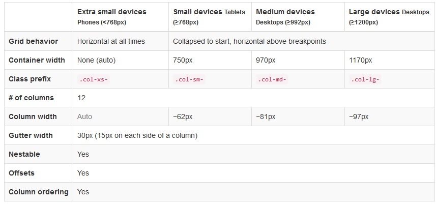
Source -http://getbootstrap.com/css/
each part is divided into 12 columns, so if you want to use 25% of lg screen size you need to use .col-lg-3, for the same element you can use .col-md-4 in a medium device to cover 33% of width, .col-sm-6 will give you 50% of small screen device's and .col-xs-12 will give you 100% of extra-small devices.
For example:-
<div class="row">
<!--Covers small device 50%(col-sm-6) width while 33%(col-lg-3) of large device-->
<div class="col-sm-6 col-lg-3 col-xs-12 col-md-4">
This is part of our grid.
</div>
<!--Similarly it covers 25% width of medium size device(col-md-4) while 100%(col-sm-12) of small device-->
<div class="col-sm-6 col-lg-3 col-xs-12 col-md-4">
This is part of our grid.
</div>
<div class="col-sm-6 col-lg-3 col-xs-12 col-md-4">
This is part of our grid.
</div>
<div class="col-sm-6 col-lg-3 col-xs-12 col-md-4">
This is part of our grid.
</div>
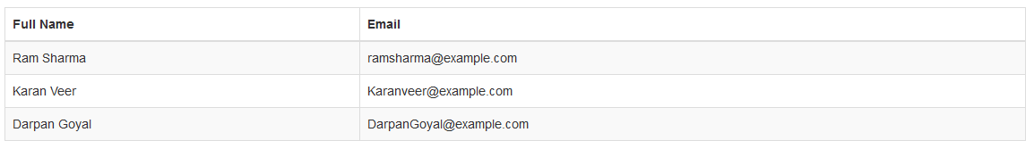
</div>Bootstrap Table
A basic Bootstrap table has a light padding and only horizontal dividers.
->The .table class adds basic styling to a table
-> The .table-striped class adds zebra-stripes to rows of the table, means it one row background will be dark and second row will have light background, then again dark, and then light, and so on.
->If you want to add border in bootstrap table use .table-bordered class
-> And to add hover effect(gray background on hover) on the table row use .table-hover class
So we use all the above bootstrap classes in a table with the following code
<table class="table table-hover table-bordered table-striped ">
          <thead>
              <tr>
                  <th>Full Name</th>

                  <th>Email</th>
              </tr>
          </thead>
          <tbody>
              <tr>
                  <td>Ram Sharma</td>
                  <td>ramsharma@example.com</td>
              </tr>
              <tr>
                  <td>Karan Veer</td>
                  <td>Karanveer@example.com</td>
              </tr>
              <tr>
                  <td>Darpan Goyal</td>
                  <td>DarpanGoyal@example.com</td>
              </tr>
          </tbody>
      </table>
Output Will be:-
Contextual Classes in bootstrap table
Contextual classes can be used to color table rows (<tr>) or table cells (<td>), suppose we add '.success ' class in above table's first row and .danger in second then code will be :-
<table class="table table-hover table-bordered table-striped ">
          <thead>
              <tr>
                  <th>Full Name</th>

                  <th>Email</th>
              </tr>
          </thead>
          <tbody>
              <tr class="success">
                  <td>Ram Sharma</td>
                  <td>ramsharma@example.com</td>
              </tr>
              <tr class="danger">
                  <td>Karan Veer</td>
                  <td>Karanveer@example.com</td>
              </tr>
              <tr>
                  <td>Darpan Goyal</td>
                  <td>DarpanGoyal@example.com</td>
              </tr>
          </tbody>
      </table>
Output :-
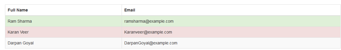
Note:-
Contextual classes can be used with<p>or with any another html element also, it is uses to give background colors to element.
Contextual classes.active,.success,.info,.warning,.danger
Responsive tables
You can make your table responsive by adding a div element with class .table-responsive as parent element of the table, which will add horizontal scroll in the table when checking web page in mobile or low-resolution browser.
So code will be
 <div class="table-responsive">
  <table class="table table-hover table-bordered table-striped">
    ...
  </table>
</div>
That's it, for part 1, click here to continue reading second part of tutorial
 Buy us a coffee
 Become a Patron