
With the new Bootstrap 4, the grid system is changed than Bootstrap 3 and here in this article, I am going to explain the bootstrap 4 grid system with details.In the new Bootstrap 4, there are five responsive breakpoints for different sizes of devices in Bootstrap 4 grid layout system. Each row is divided into 12 columns and by mixing and matching, you can create different layouts you desire. The grid system is based on flexbox and is fully responsive.
To create a simple layout using Bootstrap 4, create a div with a container class. Place all the rows and columns inside this container in order for them to have proper placement on the screen. There are two types of container in Bootstrap 4:
- container – for fixed width (no extra space for both sides)
- container-fluid – for full-width fluid (liquid-like grids)
Bootstrap 4 Grid basics
The grid system uses three main CSS classes to create the needed layout – .container, .row and .col. The container covers the complete layout and then the rows and then the columns.
- The .container class is used for centering the content with fixed width while .container-fluid is used for responsive full-width layout.
- The .row class is used to include all horizontal columns divided into 12 equal width.
- The actual content should be placed inside the columns using .col or .col-* class. For example, a row can contain two columns like .col-8 + .col-4. The column should be the immediate child of the row class.
- All columns use flexbox which means simple using .col class will divide the row into equal width columns. For example, when you use two .col classes in a row then it will be divided into two 50% areas automatically.
- You can explicitly define column width like .col-sm-8 which will occupy 3/4 (75%) of the row’s width.
- By default columns and rows have padding and margin for better visibility. You can remove the margin and padding by adding an additional “.noglutter” class with “.row”.
- There are 5 breakpoints offered in Bootstrap 4 – extra small, small, medium, large and extra large.
- By default, the .col class will be applied to all tiers of breakpoints. Any other classes used will be applied to all higher level devices. For example, .col-sm-4 (small) will be applied to small, medium, large and extra large devices.
Bootstrap 4 Grid classes
The Bootstrap 4 grid system has five classes:
.col-(extra small devices - screen width less than 576px).col-sm-(small devices - screen width equal to or greater than 576px).col-md-(medium devices - screen width equal to or greater than 768px).col-lg-(large devices - screen width equal to or greater than 992px).col-xl-(xlarge devices - screen width equal to or greater than 1200px)
The classes above can be combined to create more dynamic and flexible layouts.
Equal width Multiple rows grid Bootstrap 4 example
Simply create a multiple columns layout within a row using “.col” classes continuously. You just need to insert “.w-100” class where a breakpoint is required.
<div class="row">
  <div class="col">.col</div>
  <div class="col">.col</div>
  <div class="w-100"></div>
  <div class="col">.col</div>
  <div class="col">.col</div>
  <div class="w-100"></div>
  <div class="col">.col</div>
  <div class="col">.col</div>
</div>
Here is the output:
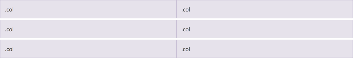
Example of Bootstrap 4 Grid System
Let's take a look on another example which explains a lots of details of Bootstrap 4 grid system
<!DOCTYPE html>
<html lang="en">
<head>
<title>Bootstrap Example</title>
<meta charset="utf-8">
<meta name="viewport" content="width=device-width, initial-scale=1">
<link rel="stylesheet" href="https://maxcdn.bootstrapcdn.com/bootstrap/4.1.3/css/bootstrap.min.css">
<script src="https://ajax.googleapis.com/ajax/libs/jquery/3.3.1/jquery.min.js"></script>
<script src="https://cdnjs.cloudflare.com/ajax/libs/popper.js/1.14.3/umd/popper.min.js"></script>
<script src="https://maxcdn.bootstrapcdn.com/bootstrap/4.1.3/js/bootstrap.min.js"></script>
</head>
<body>
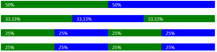
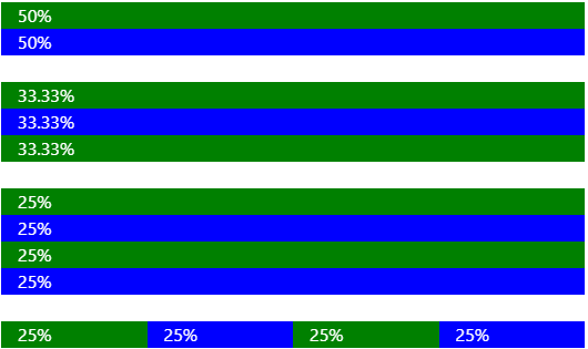
<div class="container-fluid">
<h1>Basic Grid Structure</h1>
<div class="container-fluid">
<!-- Control the column width, and how they should appear on different devices -->
<div class="row">
<div class="col-sm-6" style="background-color:yellow;">50%</div>
<div class="col-sm-6" style="background-color:orange;">50%</div>
</div>
<br>
<div class="row">
<div class="col-sm-4" style="background-color:yellow;">33.33%</div>
<div class="col-sm-4" style="background-color:orange;">33.33%</div>
<div class="col-sm-4" style="background-color:yellow;">33.33%</div>
</div>
<br>
<!-- Or let Bootstrap automatically handle the layout -->
<div class="row">
<div class="col-sm" style="background-color:yellow;">25%</div>
<div class="col-sm" style="background-color:orange;">25%</div>
<div class="col-sm" style="background-color:yellow;">25%</div>
<div class="col-sm" style="background-color:orange;">25%</div>
</div>
<br>
<div class="row">
<div class="col" style="background-color:yellow;">25%</div>
<div class="col" style="background-color:orange;">25%</div>
<div class="col" style="background-color:yellow;">25%</div>
<div class="col" style="background-color:orange;">25%</div>
</div>
</div>
</div>
</body>
</html>
Here is the working fiddle link and output image in desktop view
Mobile View output
Variable width content Bootstrap 4 example
Width of the columns can be restricted to the actual content using ".col-{breakpoint}-auto" class, for example, ".col-md-auto".
<div class="container">
  <div class="row justify-content-md-center">
    <div class="col col-lg-2">
      .col .col-lg-2
    </div>
    <div class="col-md-auto">
      .col-md-auto (variable width)
    </div>
    <div class="col col-lg-2">
      .col .col-lg-2
    </div>
  </div>
  <div class="row">
    <div class="col">
      .col
    </div>
    <div class="col-md-auto">
      .col-md-auto (variable width)
    </div>
    <div class="col col-lg-2">
      .col .col-lg-2
    </div>
  </div>
</div>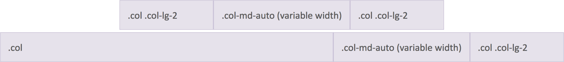
Column Offsetting
Bootstrap 4 dropped the column offsetting feature due to the use of flexbox grid layout. But you can still move the columns away using margin utility classes like "ml-auto", "mr-auto", etc.
<div class="row">
  <div class="col-md-4">.col-md-4</div>
  <div class="col-md-4 ml-auto">.col-md-4 .ml-auto</div>
</div>
<div class="row">
  <div class="col-md-3 ml-md-auto">.col-md-3 .ml-md-auto</div>
  <div class="col-md-3 ml-md-auto">.col-md-3 .ml-md-auto</div>
</div>
<div class="row">
  <div class="col-auto mr-auto">.col-auto .mr-auto</div>
  <div class="col-auto">.col-auto</div>
</div>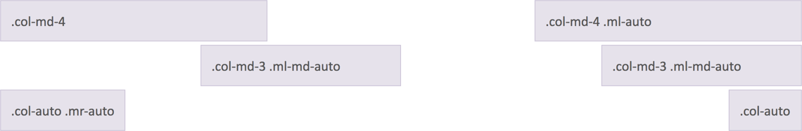
Nesting Within Grid
Columns can be nested within other columns as shown below:
<div class="row">
  <div class="col-sm-9">
    Level 1: .col-sm-9
    <div class="row">
      <div class="col-8 col-sm-6">
        Level 2: .col-8 .col-sm-6
      </div>
      <div class="col-4 col-sm-6">
        Level 2: .col-4 .col-sm-6
      </div>
    </div>
  </div>
</div>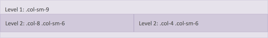
Bootstrap 4 Grid Rules
Here are some of the Bootstrap 4 grid system rules:
- Rows must be placed within a
.container(fixed-width) or.container-fluid(full-width) for proper alignment and padding - Use rows to create horizontal groups of columns
- Content should be placed within columns, and only columns may be immediate children of rows
- Predefined classes like
.rowand.col-sm-4are available for quickly making grid layouts - Columns create gutters (gaps between column content) via padding. That padding is offset in rows for the first and last column via negative margin on
.rows - Grid columns are created by specifying the number of 12 available columns you wish to span. For example, three equal columns would use three
.col-sm-4 - Column widths are in percentage, so they are always fluid and sized relative to their parent element
- The biggest difference between Bootstrap 3 and Bootstrap 4 is that Bootstrap 4 now uses flexbox, instead of floats. One big advantage with flexbox is that grid columns without a specified width will automatically layout as "equal width columns" (and equal height). Example: Three elements with
.col-smwill each automatically be 33.33% wide from the small breakpoint and up.
Bootstrap 4 Grid system details in Table
| Grid | Extra Small | Small | Medium | Large | Extra Large |
|---|---|---|---|---|---|
| Breakpoint | <576px | =576px | =768px | =992px | =1200px |
| CSS Class | .col- | .col-sm- | .col-md- | .col-lg- | .col-xl- |
| Columns | Each row is divided in to 12 equal width columns. | ||||
| Gutter Width | 15 pixels on each side of the column totaling to 30px. | ||||
| Nesting | Yes, columns can be nested within other columns. | ||||
| Column Ordering | Yes, content inside any of the column within a row can be reordered. | ||||
 Buy us a coffee
 Become a Patron