
While creating any web-application we definitely need to create social media pages,groups for it, so this is where we need some best designed social media icons and social media icons hover effects with CSS, so in this article I will provide you list of various social media icons with hover effetcs code using CSS.
Before we begin, you can take a look at Jai prakash's answer which shows How to create social media share buttons using HTML & JavaScript? (no external library)? This code let's you create social media icons without any effects and without using any external javascript plugins.
Social Media Icons with hover effect
This example is purely based on CSS & HTML, and the hover effects are done using CSS transition, here is the HTML/CSS code for it
<!-- Font awesome import -->
<link rel="stylesheet" href="//netdna.bootstrapcdn.com/font-awesome/4.0.3/css/font-awesome.min.css">

<!-- Simple social icons -->
<ul class="icon-effect icon-effect-1a">
  <li><a href="#" class="icon"><i class="fa fa-facebook"></i></a></li>
  <li><a href="#" class="icon"><i class="fa fa-twitter"></i></a></li>
  <li><a href="#" class="icon"><i class="fa fa-github"></i></a></li>
</ul>
CSS
/*
* Basic styles
*
* There are basic styles for body.
*/
body {
  background-color: #ddd;
}
/* Color variables */
/* Mixins */
body {
  background-color: #ddd;
}
.transition-animation {
  -webkit-transition: all 0.5s;
  -moz-transition: all 0.5s;
  -ms-transition: all 0.5s;
  -o-transition: all 0.5s;
  transition: all 0.5s;
}
/* Ul styles */
ul {
  list-style: none;
}
ul > li {
  display: inline;
  margin-right: 20px;
}
/*
* Icon styles
*
* There are styles for icon and everything which are connected with it.
*/
.icon {
  display: inline-block;
  position: relative;
  z-index: 1;
  width: 50px;
  height: 50px;
  border-radius: 50%;
  font-size: 24px;
  color: #f1f1f1;
  line-height: 52px;
  text-align: center;
  background-color: #48a65b;
}
.icon:after {
  position: absolute;
  width: 100%;
  height: 100%;
  border-radius: 50%;
  content: '';
  box-sizing: content-box;
}
/* Hover effect */
.icon-effect .icon {
  -webkit-transition: all 0.5s;
  -moz-transition: all 0.5s;
  -ms-transition: all 0.5s;
  -o-transition: all 0.5s;
  transition: all 0.5s;
}
.icon-effect .icon:after {
  top: -7px;
  left: -7px;
  padding: 7px;
  box-shadow: 0 0 0 4px #f1f1f1;
  -webkit-transition: all 0.5s;
  -moz-transition: all 0.5s;
  -ms-transition: all 0.5s;
  -o-transition: all 0.5s;
  transition: all 0.5s;
  -webkit-transform: scale(0.8);
  -moz-transform: scale(0.8);
  -ms-transform: scale(0.8);
  -o-transform: scale(0.8);
  transform: scale(0.8);
  opacity: 0;
}
.icon-effect-1a .icon:hover {
  background-color: #f1f1f1;
  color: #48a65b;
}
.icon-effect-1a .icon:hover:after {
  -webkit-transform: scale(1);
  -moz-transform: scale(1);
  -ms-transform: scale(1);
  -o-transform: scale(1);
  transform: scale(1);
  opacity: 1;
}
Output:
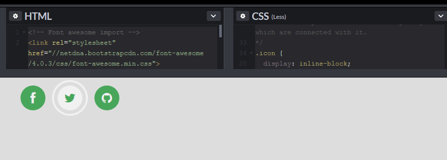
CodePen
Social Media Icon glow on hover effect CSS
In this example, Hovering over social media icons changes its color(makes it related to social platform theme color).
Social Media animated icons
This example shows infintely auto-animated social media icons using CSS
Hover Social icon effect
This example shimply replaces the name of social media with it's icon, as soon as user hover the name of social media.
Animated Social Icons
This fiddle example, has few ways to shows you, how you can animate social icons using SCSS, here is the fiddle
Spinning social Icons effect on hover
In this example, We will use CSS transform property and the rotate() function to create spinning social media icons effects.
Include font-awesome and below HTML
<div class="icons-container">
    <div class="social-icons spinned">
        <a class="item facebook" href="#"><em class="fa fa-facebook"></em></a>
        <a class="item twitter" href="#"><em class="fa fa-twitter"></em></a>
        <a class="item google" href="#"><em class="fa fa-google"></em></a>
        <a class="item linkedin" href="#"><em class="fa fa-linkedin"></em></a>
        <a class="item instagram" href="#"><em class="fa fa-instagram"></em></a>
    </div>
</div>
CSS
.icons-container{
    height: 100px;
    width: 400px;
    position: fixed;
    top: 50%;
    left: 50%;
    margin-top: -100px;
    margin-left: -200px;
}

.social-icons .item {
    display: inline-block;
    margin: 5px;
    width: 50px;
    height: 50px;
    transition: .3s all;
    position: relative;
    -webkit-transition: .3s all;
    text-align: center;
    color: #fff;
    background-color: #fff;
    line-height: 48px;
    border-radius: 50px;
    -webkit-box-shadow: 0 5px 11px 0 rgba(0,0,0,0.18),0 4px 15px 0 rgba(0,0,0,0.15);
    -moz-box-shadow: 0 5px 11px 0 rgba(0,0,0,0.18),0 4px 15px 0 rgba(0,0,0,0.15);
    box-shadow: 0px 5px 11px 0px rgba(0,0,0,0.18), 0px 4px 15px 0px rgba(0,0,0,0.15);
}

.social-icons.spinned .item:hover {
    -webkit-animation: Social-Icons-Flipping .3s;
    animation: Social-Icons-Flipping .3s
}
.social-icons .item:hover {
    text-decoration: none;
    background-color: #42474E;
    box-shadow: 0 -1px 0 transparent inset, 0 2px 3px rgba(0, 0, 0, .1), 0 4px 8px rgba(0, 0, 0, .3);
    color: #fff!important
}
.social-icons .item .fa {
    font-size: 15px;
    font-weight: 500;
}

.social-icons .facebook {
    color: #425F9C!important
}
.social-icons .twitter {
    color: #00ACEE!important
}
.social-icons .google {
    color: #c00!important
}
.social-icons .linkedin {
    color: #0073B2!important
}
.social-icons .youtube {
    color: #EB3E40!important
}
.social-icons .instagram {
    color: #5E8AAC!important
}

.facebook:hover {
    background-color: #425F9C!important
}
.twitter:hover {
    background-color: #00ACEE!important
}
.google:hover {
    background-color: #c00!important
}
.linkedin:hover {
    background-color: #0073B2!important
}
.youtube:hover {
    background-color: #EB3E40!important
}
.instagram:hover {
    background-color: #5E8AAC!important
}

@-webkit-keyframes Social-Icons-Flipping {
    0% {
        -webkit-transform: rotate(0);
        transform: rotate(0)
    }
    100% {
        -webkit-transform: rotate(360deg);
        transform: rotate(360deg)
    }
}
@keyframes Social-Icons-Flipping {
    0% {
        -webkit-transform: rotate(0);
        transform: rotate(0)
    }
    100% {
        -webkit-transform: rotate(360deg);
        transform: rotate(360deg)
    }
}
Here is the fiddle demo.
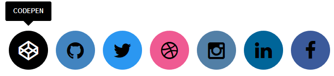
Social icons with different hover effects
This example shows various example of hover effect on social icons.
Social Icons with tool-tip
Yet another hover effect on social media icons using CSS, it shows tool-tip data when hover over it.
Floating social button effect on hover
Simple but good looking effect of social icons on hover, CSS text-shadow and transition properties make icons look beautiful.
I hope the above examples fulfil your need for social media icons hover effect, if I have missed any CSS based social media icon hover effect, please include your CodePen or Fiddle link in the comments.
 Buy us a coffee
 Become a Patron