
This is second part of bootstrap tutorial if you haven't read the first part, and you beginner, please read the first part here
Form Layout
There can be three type of bootstrap forms:-
Basic Forms
With Bootstrap, the basic structure of forms comes automatically, i.e., individual form controls automatically receive some global styling. To create a basic bootstrap form do the following −
-
Create <form> element
-
Wrap labels and controls in a <div> with class .form-group.(needed for optimum spacing)
-
Add a class of .form-control to all textual <input>, <textarea>, and <select> elements.
Example code :-
<!--Start Form element-->
<form>
 <!--Create a div with class form-group-->
  <div class="form-group">
    <label for="email">Email address:</label>
  <!--add class form-control to input-text to use bootstrap-->
    <input type="email" class="form-control" id="email">
  </div>
  <div class="form-group">
    <label for="pwd">Password:</label>
    <input type="password" class="form-control" id="pwd">
  </div>
  <div class="checkbox">
    <label><input type="checkbox"> Remember me</label>
  </div>
 <!--give bootstrap class to button, .btn is used for all buttons, .btn-default adds default color of theme in button-->
  <button type="submit" class="btn btn-default">Submit</button>
</form>
I have explained the bootstrap within above HTML form example using comments.
Inline Form
To create a form where all of the elements are inline, left aligned and labels are alongside, add the class .form-inline to the <form> tag.
<form class="form-inline" role="form">
<!--form components here-->
</form>
Horizontal Form
It Aligns labels and groups of form controls in a horizontal layout. To create a form that uses the horizontal layout, do the following −
-
Add a class of .form-horizontal to the <form> element.
-
Wrap labels and controls in a <div> with class .form-group.
-
Add a class of .control-label to the labels.
Example :-
<form class="form-horizontal" role="form">
   <div class="form-group">
      <label for = "firstname" class="col-sm-2 control-label">First Name</label>
      <div class="col-sm-10">
         <input type="text" class="form-control" id="firstname" placeholder="Enter First Name">
      </div>
   </div>
</form>
Other Classes and its use in Form
1 .form-control-feedback: Form validation class
2 .form-control-static: Adds plain text next to a form label within a horizontal form
3 .input-group: Container to enhance an input by adding an icon, text or a button in front or behind it as a "help text"
4 .input-group-sm : Small input group
5 .input-group-lg : large input group
6 .input-lg : Large input field
7 .input-sm: Small input field (this is generally used class for input field)
8 .input-group-addon: Used together with the .input-group class, this class makes it possible to add an icon or help text next to the input field
9 .input-group-btn : Used together with the .input-group class, this class attaches a button next to an input. (used in search bar)
Bootstrap Image Classes
Bootstrap comes with image helper classes which give us three type of shape to images:-
- Rounded: use
.img-roundedclass which adds rounded corners to an image (IE8 does not support rounded corners) - Circle: use .img-circle − makes the entire image round by adding border-radius
- Thumbnail: use
.img-thumbnailclass shapes the image to a thumbnail
Example code:-
<img src="images/testing.png" class="img-rounded" alt="rounded" />

<img src="images/testing.png" class="img-circle" alt="circle" />

<img src="images/testing.png" class="img-thumbnail" alt="thumbnail" />
Responsive Images
Images come in all sizes. So do screens. Responsive images automatically adjust to fit the size of the screen.Create responsive images by adding an .img-responsive class to the <img> tag. The image will then scale nicely to the parent element.
Responsive Embeds
Bootstrap let videos or slideshows scale properly according to the device.Classes can be applied directly to html elements like <iframe>, <embed>, <video>, and <object>
For example:
 <div class="embed-responsive embed-responsive-16by9">
  <iframe class="embed-responsive-item" src="..."></iframe>
</div>
Bootstrap Buttons
Bootstrap provides different styles of buttons, Anything that is given a class of .btn will inherit the default look of a gray button with rounded corners. Bootstrap includes six predefined button styles, each serving its own semantic purpose.
<!-- Provides extra visual weight and identifies the primary action in a set of buttons -->
<button type="button" class="btn btn-primary">Primary</button>

<!-- Secondary, outline button -->
<button type="button" class="btn btn-secondary">Secondary</button>

<!-- Indicates a successful or positive action -->
<button type="button" class="btn btn-success">Success</button>

<!-- Contextual button for informational alert messages -->
<button type="button" class="btn btn-info">Info</button>

<!-- Indicates caution should be taken with this action -->
<button type="button" class="btn btn-warning">Warning</button>

<!-- Indicates a dangerous or potentially negative action -->
<button type="button" class="btn btn-danger">Danger</button>

<!-- Deemphasize a button by making it look like a link while maintaining button behavior -->
<button type="button" class="btn btn-link">Link</button>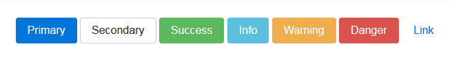
The .btn classes are designed to be used with the <button> element. However, you can also use these classes on <a> or <input> elements (though some browsers may apply a slightly different rendering).
Outline buttons
In need of a button, but not the hefty background colors they bring? Replace the default modifier classes with the .btn-outline-* ones to remove all background images and colors on any button.
Example -
<button type="button" class="btn btn-outline-primary">Primary</button>Button Sizes
Bootstrap button size can be changed using these classes:
| .btn-lg | This makes the button size large. |
| .btn-sm | This makes the button size small. |
| .btn-xs | This makes the button size extra small. |
| .btn-block | This creates block level buttons—those that span the full width of a parent. |
Button State
Bootstrap provides classes which allow you to change the state of buttons as active, disabled etc.
Active state
Buttons will appear pressed (with a darker background, darker border, and inset shadow) when active. There’s no need to add a class to <button>s as they use a pseudo-class. However, you can still force the same active appearance with .active (and include the aria-pressed="true" attribute) should you need to replicate the state programmatically.
Disabled state
Make buttons look inactive by adding the disabled boolean attribute to any <button> element.
Disabled buttons using the <a> element behave a bit different:
<a>s don’t support thedisabledattribute, so you must add the.disabledclass to make it visually appear disabled.- Some future-friendly styles are included to disable all
pointer-eventson anchor buttons. In browsers which support that property, you won’t see the disabled cursor at all. - Disabled buttons should include the
aria-disabled="true"attribute to indicate the state of the element to assistive technologies.
Example :-
<!--Active buttons-->
<a href="#" class="btn btn-primary btn-lg active" role="button" aria-pressed="true">Primary link</a>
<a href="#" class="btn btn-secondary btn-lg active" role="button" aria-pressed="true">Link</a>


<!--Disabled buttons-->

<button type="button" class="btn btn-lg btn-primary" disabled>Primary button</button>
<button type="button" class="btn btn-secondary btn-lg" disabled>Button</button>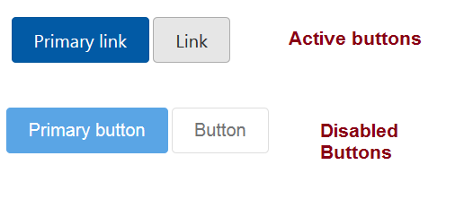
That's it, we will continue this tutorial in another article.
 Buy us a coffee
 Become a Patron