
In this article, we are going to discuss bootstrap and creating a responsive navigation bar using this CSS framework. But before we head for it, let's discuss it.
What is Bootstrap?
->Bootstrap is the most popular HTML, CSS, and JavaScript framework for developing a responsive and mobile friendly website.
->Bootstrap is a free and open-source front-end web framework for designing websites and web applications. It contains HTML- and CSS-based design templates for typography, forms, buttons, navigation and other interface components, as well as optional JavaScript extensions.
->It is used for easier and faster web development.
->Bootstrap also gives you the ability to easily create responsive designs.
Responsive Web website meaning
A website is called responsive website which can automatically adjust itself to look good on all devices, from smart phones to desktops etc.
Advantages of Bootstrap
The biggest advantage of using Bootstrap is that it comes with free set of tools for creating flexible and responsive web layouts as well as common interface components.
Save lots of time - You can save lots of time and efforts using the Bootstrap predefined design templates and classes and concentrate on other development work
Responsive features - Using Bootstrap you can easily create responsive designs. Bootstrap responsive features make your web pages to appear more appropriately on different devices and screen resolutions without any change in markup.
Open Souce - One of the best parts is it is free to use.
Compatibility -It is compatible on most of the browsers like Chrome, Firefox, Internet Explorer, Safari and Opera etc and yes, of course, compatible with mobile browsers also.
Note :- Bootstrap use jQuery for JavaScript plugins (like modals, tooltips, etc). However, if you just use the CSS part of Bootstrap, you don't need jQuery.
Grid System
The Bootstrap 3 grid system applies to mobile first. We can understand it easily, as it is divided into four parts Large(lg ), Medium(md ), Small(sm), Extra Small(xs),
1. lg is for above 1200px width
2. md is for Desktops which has width >=992px
3. sm is for Small devices like tablets (>= 768px)
4. xs is fo small devices like Mobile/Smartphones which has width below 768px
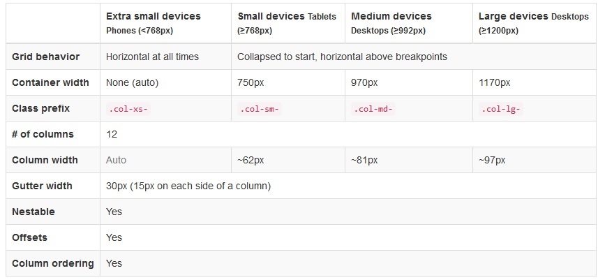
Source -http://getbootstrap.com/css/
each part is divided into 12 columns, so if you want to use 25% of lg screen size you need to use .col-lg-3, for the same element you can use .col-md-4 in a medium device to cover 33% of width, .col-sm-6 will give you 50% of small screen device's and .col-xs-12 will give you 100% of extra-small devices.
For example:-
<div class="row">
<!--Covers small device 50%(col-sm-6) width while 33%(col-lg-3) of large device-->
    <div class="col-sm-6 col-lg-3 col-xs-12 col-md-4">
        This is part of our grid.
    </div>
<!--Similarly it covers 25% width of medium size device(col-md-4) while 100%(col-sm-12) of small device-->
    <div class="col-sm-6 col-lg-3 col-xs-12 col-md-4">
        This is part of our grid.
    </div>

    <div class="col-sm-6 col-lg-3 col-xs-12 col-md-4">
        This is part of our grid.
    </div>

    <div class="col-sm-6 col-lg-3 col-xs-12 col-md-4">
        This is part of our grid.
    </div>
</div>
Bootstrap Navigation bar
You can use the Bootstrap navbar component to create responsive navigation header for your website or application. These responsive navbars initially collapsed on devices having small viewports like cell-phones but expand when user click the toggle button. However, it will be horizontal as normal on the medium and large devices like laptop or desktop.
A standard navigation bar is created with <nav class="navbar navbar-default">
Let's create top of navigation first
<nav class="navbar navbar-default">
  <div class="container-fluid">
    <div class="navbar-header">
      <a class="navbar-brand" href="#">Brand name</a>
    </div>
    <ul class="nav navbar-nav">
      <li class="active"><a href="#">Home</a></li>
      <li><a href="#">Page 1</a></li>
      <li><a href="#">Page 2</a></li>
      <li><a href="#">Page 3</a></li>
    </ul>
  </div>
</nav>
If you want to add dropdown in any link then your code would be like
 <nav class="navbar navbar-inverse">
  <div class="container-fluid">
    <div class="navbar-header">
      <a class="navbar-brand" href="#">Brand Name</a>
    </div>
    <ul class="nav navbar-nav">
      <li class="active"><a href="#">Home</a></li>
      <!--give list a class .dropdown-->
       <li class="dropdown">
        <!--Here is dropdown code-->
        <a class="dropdown-toggle" data-toggle="dropdown" href="#">Page 1
        <!--Code to show caret sign-->
        <span class="caret"></span></a>
        <!--here goes your list-->
        <ul class="dropdown-menu">
          <li><a href="#">Page 1-1</a></li>
          <li><a href="#">Page 1-2</a></li>
          <li><a href="#">Page 1-3</a></li>
        </ul>
      </li>
      <li><a href="#">Page 2</a></li>
      <li><a href="#">Page 3</a></li>
    </ul>
  </div>
</nav>
Right aligned Buttons
You can align buttons by using .navbar-right class. For example :-
 <nav class="navbar navbar-inverse">
  <div class="container-fluid">
    <div class="navbar-header">
      <a class="navbar-brand" href="#">Brand Name</a>
    </div>
    <ul class="nav navbar-nav">
      <li class="active"><a href="#">Home</a></li>
      <li><a href="#">Page 1</a></li>
      <li><a href="#">Page 2</a></li>
    </ul>
    <!--Right aligned buttons-->
    <ul class="nav navbar-nav navbar-right">
      <li><a href="#"><span class="glyphicon glyphicon-user"></span> Sign Up</a></li>
      <li><a href="#"><span class="glyphicon glyphicon-log-in"></span> Login</a></li>
    </ul>
  </div>
</nav>
Responsive Menu with fixed top bar
Now let's create a sticky top navigation bar using .navbar-fixed-top in addition to the .navbar and .navbar-default base class to create navbars that is fixed on the top.
Also, we will add new code for mobile approach, to show a button on top right when in mobile device :-
  <!-- .navbar-fixed-top class let's navigation bar stick at top when you scroll the page -->
<nav role="navigation" class="navbar navbar-default navbar-fixed-top">
 <div class="container">
    <!-- Brand and toggle get grouped for better mobile display -->
            <div class="navbar-header">
                <button type="button" data-target="#navbarCollapse" data-toggle="collapse" class="navbar-toggle">
                    <span class="sr-only">Toggle navigation</span>
                    <span class="icon-bar"></span>
                    <span class="icon-bar"></span>
                    <span class="icon-bar"></span>
                </button>
                <a href="#" class="navbar-brand">Brand</a>
            </div>
           <!-- Collection of nav links and other content for toggling -->
            <div id="navbarCollapse" class="collapse navbar-collapse">
                <ul class="nav navbar-nav">
                    <li class="active"><a href="#">Home</a></li>
                   <li><a href="#">Profile</a></li>
                    <li><a href="#">Messages</a></li>
                </ul>
                <ul class="nav navbar-nav navbar-right">
                    <li><a href="#">Login</a></li>
                </ul>
            </div>
        </div>
    </nav>
Output of the above code will be like this in desktop
In mobile, it will be like
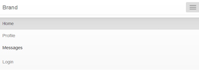
You can check mobile view in firefox by clicking Ctrl+Shift+M , while in google chrome you can click same buttons and get mobile view or you need inspect element then second button from top-left of console will brink mobile view.
 Buy us a coffee
 Become a Patron