
We already know about the importance of containers in CSS. The containers help in aligning and placing the content or elements within a webpage in a certain manner. It helps in separating different elements of web pages to make it visually appealing. The containers also hold a lot of elements and content inside it which makes the webpage more aesthetic in design and gives a smooth user interface. In order to move further, we will look at more efficient and flexible way of aligning or content or elements in our webpage. One way of aligning element is using floats but flexible box approach is much easier and flex modal margin doesn't collapse with the margins of its contents.
Understanding CSS3 Flexbox
Flexible boxes, or flexbox, is a new layout mode in CSS3, which allows elements to behave predictably when the page layout must accommodate different screen sizes and different display devices, it offers an alternative to Floats for defining the overall appearance of a web page.
Flexbox improves the items alignment, directions and order in the container even when they are with dynamic or even unknown size. A flex container expands items to fill available free space, or shrinks them to prevent overflow.
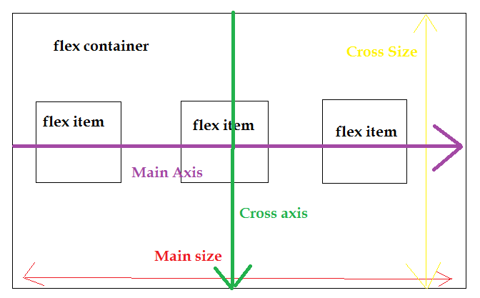
Flexible boxes use the terms main axis and cross axis. If flex-direction were column, then vertical would be the main axis and horizontal would be the cross axis. Consider the following diagram. It shows a flex container that has a flex-direction of row, meaning that the flex items follow each other horizontally across the main axis.
Flexbox consists of flex containers and flex items. A flex container is declared by setting the display property of an element to either
flex (block element) or inline-flex (inline element)
Inside a flex container there can be one or more flex items. Each child of a flex container becomes a flex item. Text directly contained in a flex container is wrapped in an anonymous flex item.
Axes : Every flexible box layout follows two axes. The main axis is the axis along which the flex items follow each other. The cross axis is the axis perpendicular to the main axis.
- The
flex-directionproperty establishes the main axis. Values can be as follows
row-reverse- If the writing-mode (direction) is left to right, the flex items will be laid out right to leftcolumn- If the writing system is horizontal, the flex items will be laid out verticallycolumn-reverse- Same as column, but reversed
- The
justify-contentproperty defines how flex items are laid out along the main axis on the current line. Values can be as follows
flex-start- Default value. Items are positioned at the beginning of the containerflex-end- Items are positioned at the end of the containercenter- Items are positioned at the center of the containerspace-between- Items are positioned with space between the linesspace-around- Items are positioned with space before, between, and after the lines
- The
align-itemsproperty defines the default for how flex items are laid out along the cross axis on the current line. Values can be as follows
stretch- Default value. Items are stretched to fit the containerflex-start- Items are positioned at the top of the containerflex-end- Items are positioned at the bottom of the containercenter- Items are positioned at the center of the container (vertically)baseline- Items are positioned at the baseline of the container
- The
align-selfproperty defines how a single flex item is aligned on the cross axis, and overrides the default established byalign-items. - The
orderproperty specifies the order of a flexible item relative to the rest of the flexible items inside the same container, for example, CSS could be something like
.first {
    -webkit-order: -1; //for Chrome use -webkit
    order: -1; //defines order as -1
}?
Check this fiddle out, remember default value of Order is 0
Example layout using Flex
HTML/CSS
<style>
.flex-container {
    display: -webkit-flex;
    display: flex;
    width:400px;
   height:400px;
   background-color:#bfbfbf
}

.flex-item {
    background-color: cornflowerblue;
    width: 100px;
    height: 100px;
    margin: 10px;
}
</style>


<div class="flex-container">
  <div class="flex-item">flex item 1</div>
  <div class="flex-item">flex item 2</div>
  <div class="flex-item">flex item 3</div>
</div>
Output will be
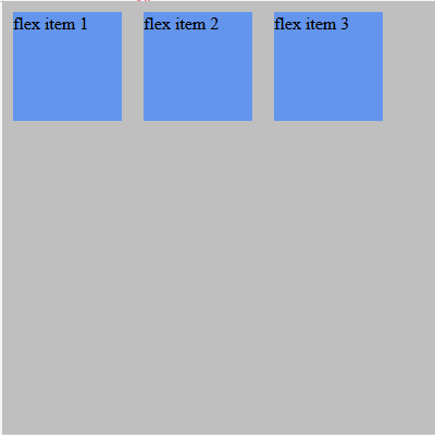
Check out the fiddle here, to try it yourself
The browser support for the latest flexbox specification is:
- Chrome 29+
- Firefox 28+
- Internet Explorer 11+
- Opera 17+
- Safari 6.1+ (prefixed with
-webkit-) - Android 4.4+
- iOS 7.1+ (prefixed with
-webkit-)
You can see detailed browser support and compatibility here.
Flexbox classes in Bootstrap 4
As we already know bootstrap is a CSS framework & so there are already built in classes for flexbox in bootstrap now, the bootstrap makes it easier to integrate Flexbox layout within the bootstrap web page. It helps in easy and distributed management of sizing of elements, so here i am going to explain some flexbox classes which you will find in Bootstrap 4.
Using Flex-box in Bootstrap
AS explained above flexbox container can be of two type inline-element or block element, bootstrap 4 has predefined classes for it .d-flex (for block element) & .d-inline-flex (inline element)
Responsive variations also exist for .d-flex and .d-inline-flex.
.d-flex.d-inline-flex.d-sm-flex.d-sm-inline-flex.d-md-flex.d-md-inline-flex.d-lg-flex.d-lg-inline-flex.d-xl-flex.d-xl-inline-flex
Using Class d-flex, flex-row
The first simple example makes use of the Bootstrap 4 CSS classes d-flex and flow-row:
<div class="d-flex flex-row">
    <div class="p-2 my-flex-item">Flex Item 1</div>
    <div class="p-2 my-flex-item">Flex Item2</div>
    <div class="p-2 my-flex-item">Flex Item 3</div>
</div>
By using these two classes we’re defining a flexbox container which arranges all items in one single row.
Output of the above code will be

Now if you want to place the items in the right hand positing using .flex-row-reverse class, so your code will be
<div class="d-flex flex-row-reverse">
  <div class="p-2 my-flex-item">Flex item 1</div>
  <div class="p-2 my-flex-item">Flex item 2</div>
  <div class="p-2 my-flex-item">Flex item 3</div>
</div>
Use .flex-column to set a vertical direction, or .flex-column-reverse to start the vertical direction from the opposite side.
Justify content
Use justify-content utilities on flexbox containers to change the alignment of flex items on the main axis (the x-axis to start, y-axis if flex-direction: column). Choose from start (browser default), end, center, between, or around.
<div class="d-flex justify-content-start">...</div>
<div class="d-flex justify-content-end">...</div>
<div class="d-flex justify-content-center">...</div>
<div class="d-flex justify-content-between">...</div>
<div class="d-flex justify-content-around">...</div>
Align items
Use align-items utilities on flexbox containers to change the alignment of flex items on the cross axis (the y-axis to start, x-axis if flex-direction: column). Choose from start, end, center, baseline, or stretch (browser default).
<div class="d-flex align-items-start">Align Start</div>
<div class="d-flex align-items-end">Align End </div>
<div class="d-flex align-items-center">Align Items Center</div>
<div class="d-flex align-items-baseline">Align Items baseline.</div>
<div class="d-flex align-items-stretch">Align Items Stretch</div>
Align self
Use align-self utilities on flexbox items to individually change their alignment on the cross axis (the y-axis to start, x-axis if flex-direction: column). Choose from the same options as align-items: start, end, center, baseline, or stretch (browser default).
<div class="align-self-start">Aligned flex item</div>
<div class="align-self-end">Aligned flex item</div>
<div class="align-self-center">Aligned flex item</div>
<div class="align-self-baseline">Aligned flex item</div>
<div class="align-self-stretch">Aligned flex item</div>
Wrapping Of Flex Items
The wrapping behavior of flex items can be controlled by applying CSS classes as well. Let’s first take a look at the default wrapping behavior without applying any special wrapping class:
<div class="d-flex flex-row flex-wrap my-flex-container">
    <div class="p-2 my-flex-item">Flex Item 1</div>
    <div class="p-2 my-flex-item">Flex Item 2</div>
    <div class="p-2 my-flex-item">Flex Item 3</div>
    <div class="p-2 my-flex-item">Flex Item 4</div>
    <div class="p-2 my-flex-item">Flex Item 5</div>
    <div class="p-2 my-flex-item">Flex Item 6</div>
    <div class="p-2 my-flex-item">Flex Item 7</div>
    <div class="p-2 my-flex-item">Flex Item 8</div>
    <div class="p-2 my-flex-item">Flex Item 9</div>
    <div class="p-2 my-flex-item">Flex Item 10</div>
    <div class="p-2 my-flex-item">Flex Item 11</div>
    <div class="p-2 my-flex-item">Flex Item 12</div>
    <div class="p-2 my-flex-item">Flex Item 13</div>
    <div class="p-2 my-flex-item">Flex Item 14</div>
    <div class="p-2 my-flex-item">Flex Item 15</div>
    <div class="p-2 my-flex-item">Flex Item 16</div>
    <div class="p-2 my-flex-item">Flex Item17</div>
    <div class="p-2 my-flex-item">Flex Item 18</div>
    <div class="p-2 my-flex-item">Flex Item 19</div>
    <div class="p-2 my-flex-item">Flex Item 20</div>
</div>

//Output will keep the items Inside the block
Ordering using Bootstrap
To apply ordering using .Order-{x} of bootstrap, for example .Order-1, .Order2 can be classes
<div class="d-flex">
    <div class="p-2 order-3">1</div>
    <div class="p-2 order-1">2</div>
    <div class="p-2 order-2">3</div>
</div>
Output:

Auto Margins
Flexbox can do some pretty awesome things when you mix flex alignments with auto margins.. The following margin classes are available:
- mr-auto: add margin to the right side of the item
- ml-auto: add margin to the left side of the item
- mt-auto: add margin to the top of the item
- mb-auto: add margin to the bottom of the item
Align content
Use align-content utilities on flexbox containers to align flex items together on the cross axis. Choose from start(browser default), end, center, between, around, or stretch. To demonstrate these utilities, we’ve enforced flex-wrap: wrap and increased the number of flex items.
<div class="d-flex align-content-end flex-wrap">
  ...
</div>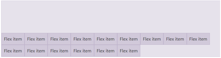
Thanks for reading,share if you have liked it, or comment on it for any query.
 Buy us a coffee
 Become a Patron