
While creating a web-application, you always need some form elements like checkbox , radio buttons, textbox etc, so in this article, I am going to provide you code with working examples to show how you can create custom style for checkbox or radio buttons using HTML, CSS & Bootstrap with various samples.
Creating Custom checkbox and radio button for HTML form using CSS
Let's take a look one by one for providing custom design to our simple radio, checkbox buttons.
Examples of Customized HTML Checkbox design using CSS
Let's take a look at some simple examples provided to give better design to html checkbox, so here is a example CSS
/* Base for label styling */
[type="checkbox"]:not(:checked),
[type="checkbox"]:checked {
  position: absolute;
  left: -9999px;
}
[type="checkbox"]:not(:checked) + label,
[type="checkbox"]:checked + label {
  position: relative;
  padding-left: 1.95em;
  cursor: pointer;
}

/* checkbox aspect */
[type="checkbox"]:not(:checked) + label:before,
[type="checkbox"]:checked + label:before {
  content: '';
  position: absolute;
  left: 0; top: 0;
  width: 1.25em; height: 1.25em;
  border: 2px solid #ccc;
  background: #fff;
  border-radius: 4px;
  box-shadow: inset 0 1px 3px rgba(0,0,0,.1);
}
/* checked mark aspect */
[type="checkbox"]:not(:checked) + label:after,
[type="checkbox"]:checked + label:after {
  content: '\2713\0020';
  position: absolute;
  top: .15em; left: .22em;
  font-size: 1.3em;
  line-height: 0.8;
  color: #09ad7e;
  transition: all .2s;
  font-family: 'Lucida Sans Unicode', 'Arial Unicode MS', Arial;
}
/* checked mark aspect changes */
[type="checkbox"]:not(:checked) + label:after {
  opacity: 0;
  transform: scale(0);
}
[type="checkbox"]:checked + label:after {
  opacity: 1;
  transform: scale(1);
}
/* disabled checkbox */
[type="checkbox"]:disabled:not(:checked) + label:before,
[type="checkbox"]:disabled:checked + label:before {
  box-shadow: none;
  border-color: #bbb;
  background-color: #ddd;
}
[type="checkbox"]:disabled:checked + label:after {
  color: #999;
}
[type="checkbox"]:disabled + label {
  color: #aaa;
}
/* accessibility */
[type="checkbox"]:checked:focus + label:before,
[type="checkbox"]:not(:checked):focus + label:before {
  border: 2px dotted blue;
}

/* hover style just for information */
label:hover:before {
  border: 2px solid #4778d9!important;
}
HTML
<p>
    <input type="checkbox" id="test1" />
    <label for="test1">Checkbox</label>
  </p>
  <p>

  <p>
    <input type="checkbox" id="test2" disabled />
    <label for="test1">Checkbox</label>
  </p>
  <p>
In the above example, with the help of CSS3 pseudocode we are able to check the status of checkbox(if it is checked or unchecked), if it is checked we are selecting the element directly following the checkbox or radio using +
Here is the working fiddle example
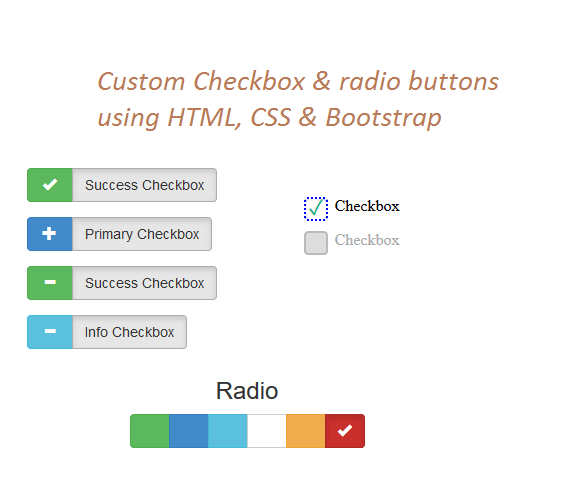
Change Color for Checkbox and Radio button using accent-color CSS property
You can now use the new accent-color CSS property and change color of radio or checkbox button easily.
Sample CSS
.colored-input {
    accent-color: #9d3039;
    height: 20px; /* not needed */
    width: 20px; /* not needed */
}
Sample HTML
<input class="colored-input" type="checkbox" />

<!-- Radio button example -->
<input class="colored-input" type="radio" />
Fiddle output:
Custom checkbox design using Bootstrap 3
If you have bootstrap and glyphicon icons already referenced in your web-application or if you want to use them in your web-application, you can create checkbox using it also, here is the simple example of it
<link href="//maxcdn.bootstrapcdn.com/bootstrap/3.3.0/css/bootstrap.min.css" rel="stylesheet" id="bootstrap-css">
<script src="//maxcdn.bootstrapcdn.com/bootstrap/3.3.0/js/bootstrap.min.js"></script>
<script src="//code.jquery.com/jquery-1.11.1.min.js"></script>

  <div class="[ form-group ]">
            <input type="checkbox" name="fancy-checkbox-success" id="fancy-checkbox-success" autocomplete="off" />
            <div class="[ btn-group ]">
                <label for="fancy-checkbox-success" class="[ btn btn-success ]">
                    <span class="[ glyphicon glyphicon-ok ]"></span>
                    <span> </span>
                </label>
                <label for="fancy-checkbox-success" class="[ btn btn-default active ]">
                    Success Checkbox
                </label>
            </div>
        </div>
and adding the CSS
.form-group input[type="checkbox"] {
    display: none;
}

.form-group input[type="checkbox"] + .btn-group > label span {
    width: 20px;
}

.form-group input[type="checkbox"] + .btn-group > label span:first-child {
    display: none;
}
.form-group input[type="checkbox"] + .btn-group > label span:last-child {
    display: inline-block;
}

.form-group input[type="checkbox"]:checked + .btn-group > label span:first-child {
    display: inline-block;
}
.form-group input[type="checkbox"]:checked + .btn-group > label span:last-child {
    display: none;
}
In this above example code, using CSS initially we are hiding default checkbox button inside .form-group class, then on clicking checkbox we are showing first-child of span element which is gyphicon icons
Here is the fiddle example
Custom Radio buttons using Bootstrap 3 and CSS
In this example to customize the design/look for radio buttons we will be using Bootstrap and Glyphicon icons again.
Basically in the below example, when radio button is not checked we are hiding icon and when checked we are showing the icon, we are doing this by toggling the .active class of button.
Here is the sample HTML Code
<link href="//netdna.bootstrapcdn.com/bootstrap/3.2.0/css/bootstrap.min.css" rel="stylesheet" id="bootstrap-css">
<script src="//code.jquery.com/jquery-1.11.1.min.js"></script>
<script src="//netdna.bootstrapcdn.com/bootstrap/3.2.0/js/bootstrap.min.js"></script>


<div class="container">

	<div class=" text-center">

		<h3>Radio</h3>

		<div class="btn-group" data-toggle="buttons">

			<label class="btn btn-success active">
				<input type="radio" name="options" id="option2" autocomplete="off" chacked>
				<span class="glyphicon glyphicon-ok"></span>
			</label>

			<label class="btn btn-primary">
				<input type="radio" name="options" id="option1" autocomplete="off">
				<span class="glyphicon glyphicon-ok"></span>
			</label>

			<label class="btn btn-info">
				<input type="radio" name="options" id="option2" autocomplete="off">
				<span class="glyphicon glyphicon-ok"></span>
			</label>

			<label class="btn btn-default">
				<input type="radio" name="options" id="option2" autocomplete="off">
				<span class="glyphicon glyphicon-ok"></span>
			</label>

			<label class="btn btn-warning">
				<input type="radio" name="options" id="option2" autocomplete="off">
				<span class="glyphicon glyphicon-ok"></span>
			</label>

			<label class="btn btn-danger">
				<input type="radio" name="options" id="option2" autocomplete="off">
				<span class="glyphicon glyphicon-ok"></span>
			</label>

		</div>


	</div>

</div>
CSS
.btn span.glyphicon {
	opacity: 0;
}
.btn.active span.glyphicon {
	opacity: 1;
}
Here is the fiddle example
Custom Radio button using CSS
In this radio button design example, we are again using pseudocode to design it and providing CSS on :checked toggle using CSS input.radio:checked ~ label:before check the complete example and it's code HTML
<div>
<input type="radio" name="radio" id="radio1" class="radio" checked/>
<label for="radio1">Male</label>
</div>

<div>
<input type="radio" name="radio" id="radio2" class="radio"/>
<label for="radio2">Female</label>
</div>
CSS
div {
	clear: both;
	margin: 0 50px;
}

label {
  width: 200px;
  border-radius: 3px;
  border: 1px solid #D1D3D4
}

/* hide input */
input.radio:empty {
	margin-left: -999px;
}

/* style label */
input.radio:empty ~ label {
	position: relative;
	float: left;
	line-height: 2.5em;
	text-indent: 3.25em;
	margin-top: 2em;
	cursor: pointer;
	-webkit-user-select: none;
	-moz-user-select: none;
	-ms-user-select: none;
	user-select: none;
}

input.radio:empty ~ label:before {
	position: absolute;
	display: block;
	top: 0;
	bottom: 0;
	left: 0;
	content: '';
	width: 2.5em;
	background: #D1D3D4;
	border-radius: 3px 0 0 3px;
}

/* toggle hover */
input.radio:hover:not(:checked) ~ label:before {
	content:'\2714';
	text-indent: .9em;
	color: #C2C2C2;
}

input.radio:hover:not(:checked) ~ label {
	color: #888;
}

/* toggle on */
input.radio:checked ~ label:before {
	content:'\2714';
	text-indent: .9em;
	color: #9CE2AE;
	background-color: #4DCB6D;
}

input.radio:checked ~ label {
	color: #777;
}

/* radio focus */
input.radio:focus ~ label:before {
	box-shadow: 0 0 0 3px #999;
}
That's it, hope it helps.
You may also like to read:
 Buy us a coffee
 Become a Patron