
In previous posts, we have explained about how to rotate image 360 using HTML, or about useful CSS animations, so in this article using CSS property transform, we will show how we can rotate image using CSS and HTML.
Table of Contents
Image rotate using CSS
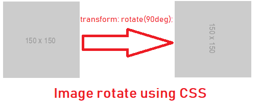
If you are creating a web-application, you may need to transform or rotate image using CSS, then you can use CSS property "transform", which can help you in rotating image, here is the basic example in which we are creating class to rotate image by 90 degree
.RotateImageBy90Degree {
    -webkit-transform: rotate(90deg);
    -moz-transform: rotate(90deg);
    -o-transform: rotate(90deg);
    -ms-transform: rotate(90deg);
    transform: rotate(90deg);
}
So, take a look at the below sample, where we have given HTML code with an image
<img src="https://via.placeholder.com/150" class="RotateImageBy90Degree ">then you will se image rotated by 90 degree, as shown below
Here is the fiddle sample of the above
OR, you can also simply rotate image by giving inline-css
<img src="https://via.placeholder.com/150" style="transform:rotate(90deg);">If you want to rotate image by 180 degree, you can change your CSS as below
.RotateImageBy180Degree {
    -webkit-transform: rotate(180deg);
    -moz-transform: rotate(180deg);
    -o-transform: rotate(180deg);
    -ms-transform: rotate(180deg);
    transform: rotate(180deg);
}
and for 270 degree as below
.RotateImageBy270Degree {
    -webkit-transform: rotate(270deg);
    -moz-transform: rotate(270deg);
    -o-transform: rotate(270deg);
    -ms-transform: rotate(270deg);
    transform: rotate(270deg);
}
Considering we have HTML as below
<img src="https://via.placeholder.com/150" class="RotateImageBy180Degree">

<img src="https://via.placeholder.com/150" class="RotateImageBy270Degree">
So, if you apply changes on the above image, you will see output as below

Continuously rotate image using CSS
If you want to rotate the image continuously, you can use CSS transform with animation property with key-frames.
Consider the below CSS
@keyframes rotation {
  from {
    transform: rotate(0deg);
  }
  to {
    transform: rotate(359deg);
  }
}

.rotate {
  animation: rotation 2s infinite linear;
}
In the above CSS, we are using rotation with infinte transform, with speed of 2s per rotation.
If we apply above CSS on the below HTML image
<img src="https://via.placeholder.com/150" class="rotate">It will keep on rotating (as we have used infinite loop) while taking 2s per loop. (transformation time from 0 -> 360 degree is 2 seconds)
Here is the fiddle sample
Flip an image
You can also flip image, using CSS transform with scaleX, consider using below code, where we are using a single image of an arrow, but showing both, left and right arrow, with the help of CSS transform
 <img
    style="transform: scaleX(-1); width:50px"
    src='https://s3-us-west-2.amazonaws.com/s.cdpn.io/t-90/left-arrow.png'
    alt=''
  >

   <img
    style=" width:50px"
    src='https://s3-us-west-2.amazonaws.com/s.cdpn.io/t-90/left-arrow.png'
    alt=''
  >
Output using Fiddle:
That's it, hope this article, clears your concept related to CSS 'transform' property and how we can use it to rotate image using HTML /CSS.
You may also like to read:
 Buy us a coffee
 Become a Patron