In one of our previous questions from user, I have answered about how to vertically align center to an image inside div using CSS, but in this article, I am going to provide you code with example to respnsive image align to center using Pure CSS or Bootstrap 3 and 4.
Table of Contents
Responsive image align in center using CSS only
So, let's initially check pure CSS version, which can be helpful when you don't want to use Bootstrap for your web-application.
You can simply align any image in center with CSS properties like "margin:0 auto" and "display:block"
margin: 0 auto;
display: block;
here is the complete example of it, suppose this is your HTML
<div class="container">
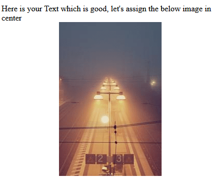
Here is your Text which is good, let's assign the below image in center
        <div class="row">
            <img class="img-responsive" src="//picsum.photos/200/300">
        </div>
    </div>
And here the CSS for it
.img-responsive{
    margin: 0 auto;
    display: block;
}
Then you will get output as below

Using "text-align:center"
You can also simply use "text-align:center" property, but you need to wrap your "img" tag inside "div" tag and then use this CSS for "div"
<div class="MainDiv">
    <img src="//placehold.it/60/60" />
</div>
CSS
.MainDiv{
    text-align: center;
}
Using "Flexbox"
This is another pure CSS approach, in which we will be using flexbox property, to perfectly center the image inside, both vertically and horizontally.
To achieve this, you need to use below CSS for "container" element which wraps the img element
<div class="container">
   <img class="img-responsive" src="//picsum.photos/200/300">
</div>
CSS
.container {
    display: flex;
    align-items: center;
    justify-content: center;
    height: 100%;
}
Here is the sample fiddle for it
Using "Position" Property
You can use the below CSS to center image using "position" property
img {
    display: block;
    position: relative;
    left: -50%;
}
.MainDiv {
    position: absolute;
    left: 50%;
}
Considering you have HTML as below
<div class="MainDiv">
    <img src="//placehold.it/60/60" />
</div>
Align image in Center using Bootstrap
While the above soluition is very easy using pure CSS, you can also use Bootstrap in-built classes, which is useful if you are already using Bootstrap in your web-application.
So, if you are using Bootstrap 3 or 4, you can use the "center-block" for an image to make it align in center for both desktop or mobile devices.
<!DOCTYPE html>
<html>
   <head>
      <meta name="viewport" content="width=device-width, initial-scale=1">
      <link rel="stylesheet" href="http://maxcdn.bootstrapcdn.com/bootstrap/3.3.6/css/bootstrap.min.css">
   </head>
   <body>
      <div class="container">
         <div class="row">
            <div class="col-md-12">
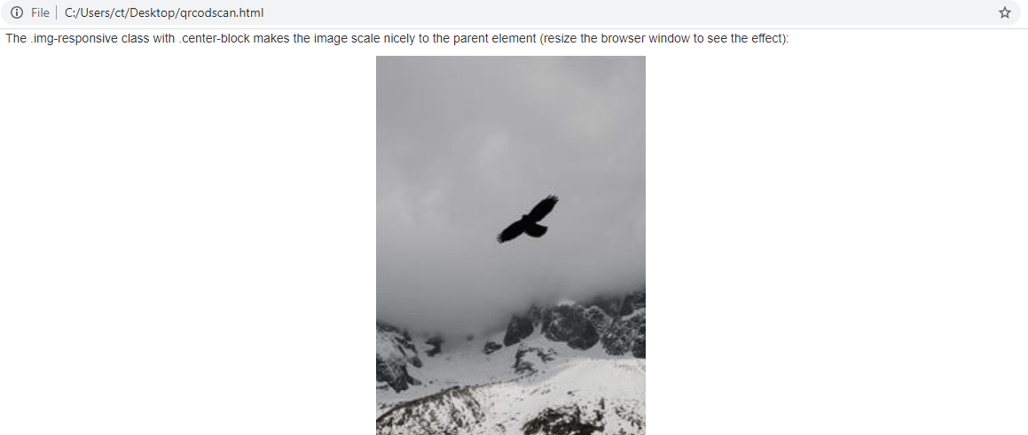
               <p>The .img-responsive class with .center-block makes the image scale nicely to the parent element (resize the browser window to see the effect):</p>
               <div>
                  <img src="//picsum.photos/200/300" class="img-responsive center-block" alt="Cinque Terre" width="304" height="236">
               </div>
            </div>
         </div>
      </div>
   </body>
</html>
Here is the output, which you should see in your browser

That's it, you can use similar classes in Bootstrap 4 or Bootstrap 5 also.
You may also like to read:
Best Source Code Management tools (Version Control tools)
Creating bootstrap switch button (Easy way)
