
In this article, I will provide you working example of creating iOS like switch (toggle) buttons using bootstrap and additional CSS.
Table of Contents
There are few easy ways to create bootstrap switch buttons, first of all, we can create custom CSS to achieve this and another way is to use jQuery plugin bootstrapswitch.js, let take a look on each of them one by one.
Creating bootstrap switch buttons using Bootstrap & Custom CSS
Step 1: Create the HTML for <input type="Checkbox">, suppose this below is our HTML
<div class="container">
    <div class="row">
	<div class="col-lg-12">

		<div class="checkbox checkbox-slider--b-flat">
			<label>
				<input type="checkbox"><span>Default</span>
			</label>
		</div>
		<div class="checkbox checkbox-slider--b-flat">
			<label>
				<input type="checkbox" checked=""><span>checked</span>
			</label>
		</div>
		<div class="checkbox checkbox-slider--b-flat">
			<label>
				<input type="checkbox" disabled=""><span>disabled</span>
			</label>
		</div>
		<div class="checkbox checkbox-slider--b-flat">
			<label>
				<input type="checkbox" disabled="" checked=""><span>disabled checked</span>
			</label>
		</div>
	</div>

</div>
</div>
Step 2: Now, add required jQuery.js , bootstrap js and bootstrap css file
<link rel="stylesheet" href="https://netdna.bootstrapcdn.com/bootstrap/3.0.0/css/bootstrap.min.css">

<script src="https://cdnjs.cloudflare.com/ajax/libs/jquery/3.1.1/jquery.min.js"></script>

<script src="https://netdna.bootstrapcdn.com/bootstrap/3.0.0/js/bootstrap.min.js"></script>
Step 3: Now we will add our Custom CSS for this
.checkbox-slider--b-flat {
  position: relative;
  margin-bottom:10px
}
.checkbox-slider--b-flat input {
  display: block;
  position: absolute;
  top: 0;
  right: 0;
  bottom: 0;
  left: 0;
  width: 0%;
  height: 0%;
  margin: 0 0;
  cursor: pointer;
  opacity: 0;
  filter: alpha(opacity=0);
}
.checkbox-slider--b-flat input + span {
  cursor: pointer;
  -webkit-user-select: none;
     -moz-user-select: none;
      -ms-user-select: none;
          user-select: none;
}
.checkbox-slider--b-flat input + span:before {
  position: absolute;
  left: 0px;
  display: inline-block;
}
.checkbox-slider--b-flat input + span > h4 {
  display: inline;
}
.checkbox-slider--b-flat input + span {
  padding-left: 50px;
}
.checkbox-slider--b-flat input + span:before {
  content: "";
  height: 24px;
  width: 40px;
  background: rgba(100, 100, 100, 0.2);
  box-shadow: inset 0 0 5px rgba(0, 0, 0, 0.8);
  transition: background 0.2s ease-out;
}
.checkbox-slider--b-flat input + span:after {
  width: 20px;
  height: 20px;
  position: absolute;
  left: 0px;
  top: 0;
  display: block;
  background: #ffffff;
  transition: margin-left 0.1s ease-in-out;
  text-align: center;
  font-weight: bold;
  content: "";
}
.checkbox-slider--b-flat input:checked + span:after {
  margin-left: 20px;
  content: "";
}
.checkbox-slider--b-flat input:checked + span:before {
  transition: background 0.2s ease-in;
}
.checkbox-slider--b-flat input + span {
  padding-left: 50px;
}
.checkbox-slider--b-flat input + span:before {
  border-radius: 20px;
  width: 45px;
}
.checkbox-slider--b-flat input + span:after {
  background: #ffffff;
  content: "";
  width: 20px;
  border: solid transparent 2px;
  background-clip: padding-box;
  border-radius: 20px;
}
.checkbox-slider--b-flat input:not(:checked) + span:after {
  -webkit-animation: popOut ease-in 0.3s normal;
          animation: popOut ease-in 0.3s normal;
}

.checkbox-slider--b-flat input:checked + span:after {
  content: "";
  margin-left: 20px;
  border: solid transparent 2px;
  background-clip: padding-box;
  -webkit-animation: popIn ease-in 0.3s normal;
          animation: popIn ease-in 0.3s normal;
}

.checkbox-slider--b-flat input:checked + span:before {
  background: #5cb85c;
}
.checkbox-slider--b-flat.checkbox-slider-md input + span:before {
  border-radius: 30px;
}
.checkbox-slider--b-flat.checkbox-slider-md input + span:after {
  border-radius: 30px;
}
.checkbox-slider--b-flat.checkbox-slider-lg input + span:before {
  border-radius: 40px;
}
.checkbox-slider--b-flat.checkbox-slider-lg input + span:after {
  border-radius: 40px;
}
.checkbox-slider--b-flat input + span:before {
  box-shadow: none;
}
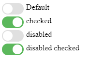
That's it, we are done, here is output
If you want to play with it, here is the working example
Create Switch (Toggle) button using Bootstrap 5 Class
If you are using latest version of bootstrap, that is bootstrap 5, then you can simply use below HTML
<div class="form-check form-switch">
  <input class="form-check-input" type="checkbox" role="switch" id="flexSwitchCheckDefault">
  <label class="form-check-label" for="flexSwitchCheckDefault">Default switch checkbox input</label>
</div>
A switch has the markup of a custom checkbox but uses the .form-switch class to render a toggle switch. Consider using role="switch" to more accurately convey the nature of the control to assistive technologies that support this role
Here is the fiddle link: https://jsfiddle.net/0ha3j2qp/
Creating bootstrap switch button using Switchery.JS
This is another easy way to convert checkbox into switch buttons, by adding switchery.js file in your project, here are the three simple steps for it
Step 1: Add the required swicthery,bootstrap & jquery js files with bootstrap/swicthery CSS files
<link rel="stylesheet" href="//maxcdn.bootstrapcdn.com/bootstrap/3.3.5/css/bootstrap.min.css">

<link rel="stylesheet" href="https://cdn.jsdelivr.net/jquery.switchery/0.8.1/switchery.min.css">

<script src="https://code.jquery.com/jquery-1.x-git.js"></script>

<script src="https://netdna.bootstrapcdn.com/bootstrap/3.0.0/js/bootstrap.min.js"></script>

<script src="https://cdn.jsdelivr.net/jquery.switchery/0.8.1/switchery.min.js"></script>
Step 2: Create checkbox button using HTML
<input type="checkbox" class="js-switch">Step 3: Add the following javascript to initialize swicthery
var elem = document.querySelector('.js-switch');
var init = new Switchery(elem);
That's it, we are done, output will be as below

Fiddle
Switchery JS settings can be changed, using following properties ( properties with default value)
defaults = {
    color             : '#64bd63'
  , secondaryColor    : '#dfdfdf'
  , jackColor         : '#fff'
  , jackSecondaryColor: null
  , className         : 'switchery'
  , disabled          : false
  , disabledOpacity   : 0.5
  , speed             : '0.1s'
  , size              : 'default'
}
Checking state in swicthery
You can easily check the state of checkbox, if it is checked or not in swicthery, just add the following HTML
<br/>
<br/>
<h3>
Check State
</h3>

<input type="checkbox" class="js-switch2 js-check-click">
<button class="button js-check-click-button">Check state</button>
And javascript
var elem2 = document.querySelector('.js-switch2');
var init2 = new Switchery(elem2);
var clickCheckbox = document.querySelector('.js-check-click');
var clickButton = document.querySelector('.js-check-click-button');
You can check it's state by clicking 'Check State' button
You can read more about switchery here
You may also like to read:
Showing Month and Year only in Bootstrap Datepicker
How to make bootstrap columns of equal height ?
Vertical Carousel (Bootstrap 4 and Bootstrap 3 With jQuery)
How to auto hide bootstrap date-picker after selecting date?
 Buy us a coffee
 Become a Patron