
In one of our previous article, we have explained what is full-stack developer, now in this article, I am going to give you details about what does responsive mean in web design and why it is important for modern web-development, also I have mentioned using which CSS frameworks, you can easily achieve responsive web design.
What is Responsive Web design? (What does responsive mean in web design)
Responsive web design means a web page layout (web page layout consists of HTML, CSS, and Images) that can be adaptive based on screen size, basically, if you are viewing a website's page on mobile, then the page must adopt its size based on mobile and when you are seeing the same page on desktop then the page must be visible in similar style on desktop also.
Using this design pattern, we don't need to use different websites for mobile and desktop, with the help of a responsive web design layout, we can use the same website for all devices.
So, Responsive Web design is the approach that suggests that design and development should automatically adjust based on different screen sizes, platforms, orientations, and view-ports.
The content must be smoothly visible on all devices (smartphones, tablets, and desktop).
For example, if a website on the desktop shows 2 columns (horizontally), then using responsive web design, and when viewing the same page on mobile, it will allow you to show scroll one column layout first and then another (vertically).
Importance and Benefits of Responsive Web-Design
There was time when people used to access websites using Desktop only, but now-a-days, people are accessing website using there smartphones and tablets also.
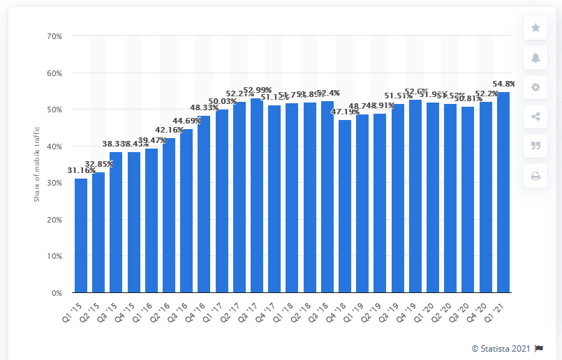 Source:Statista
You can see in the above chart, how important it is to have responsive web design, as around 54% of US traffic (as of April 2021) comes from mobile phones.
So creating a separate website for each device type (desktop,mobile, tablet) is difficult and increases cost of development also, that's where responsive design layouts help and decrease the time, and cost of website development, by using the same websites for all devices.
Here are few more benefits of using responsive layouts:
- Cost-effective and time savvy
- Boosts your website SEO, which in turn increases traffic
- Reduced bounce rates.
- Customer retention
- According to google mobile-friendliness is a ranking symbol, meaning mobile-friendly, responsive websites appears higher in the search results
- Improved User Experience
How to achieve Responsive web design?
Firstly in your HTML, you must set view-port
   <html>
      <head>
       <meta name="viewport" content="width=device-width, initial-scale=1">
     </head>
<body>....</body>
</html>
Using the meta viewport value width=device-width instructs the page to match the screen's width in device-independent pixels.
Now, you must be thinking, about how your website can achieve this responsive design, to improve your website's user experience and SEO.
Well there are several ways, I am going to point out below:
- Using CSS Media queries
- Using Bootstrap (CSS Framework)
- Using Foundation (Another CSS framework)
There are many more other frameworks, which we will mention in another post, but mostly developers using Bootstrap or Foundation CSS framework for achieving Responsive web layout.
CSS Media queries is another way, in which we have to create our own custom Media queries to achieve responsive layouts.
You may also like to read:
How to create responsive Bootstrap Nabvar
Creating sticky header on scroll using CSS
 Buy us a coffee
 Become a Patron